Capturing Green
By Charles Sovek
The Artist's Magazine - July, 1995
21 ways to take the mystery out of finding just the right green for any occasion.
Of all colors, green is the most fickle. Beyond its innocent demeanor lies an overwhelming variety of deceptive hues-from subtle and sweet to loud and brassy. So sweeping is this color blitz that, despite the huge number of "green" oil colors on the market, you can't be sure the green you buy over-the-counter is going to match the green you see in a particular scene.
So how do you find the right green? The answer is to tailor-make, or customize, your own greens. The key is to come up with a green that fits the painting, rather than bending the painting to match your green. Like the great masters, we must all learn to fashion our palettes to fit what we see. One of the biggest kicks in painting is discovering those special mixtures that reflect your artistic uniqueness. This article is designed to help you get started doing just that.
MIXING IT UP
Central to green's fickleness is its status as a secondary color, meaning it's made up of various combinations of the primary colors-red, blue and yellow. If there were only one red, one blue and one yellow, finding the right green would be a much simpler task. But the primary colors offer their own wide-ranging set of variations. And to harmonize effectively within a given painting, green, as a secondary color, must be made up of the particular set of primaries used in a given painting.
Of course, given green's range, it's a good idea to have some reference points lined up before you begin mixing colors. The following is a list of 21 visual reference points–mixed greens I've developed to help me capture greens as I see them. Of course, we all see color a little differently, so don't take these reference-point greens at face value-use them as an initial step toward capturing greens as you see them. All 21 are demonstrated on the chart on page 2.
No. 1 - Warm greens. Olive or sap green from the tube mixed with either cadmium yellow medium or deep. This is one of Sorolla's favorites.
Palette mixtures could consist of any of the warm yellow-oranges-including burnt sienna-mixed with phthalo green, phthalo blue or cerulean blue.
No. 2 - Cool greens. Viridian or phthalo green lightened with white. Can be cooled even more by adding cerulean, phthalo or French ultramarine blue.
No. 3 - Grayish greens. For perky grays, try combinations of any green neutralized with a warm red. If you're after more subdued effects, use any green mixed with a cool red, gray or black.
No. 4 - Blackish greens. Any yellow - including yellow ochre and raw sienna - will make striking, blackish greens when mixed with either lamp or ivory black. This was one of Fairfield Porter's favorite recipes for creating evocative greens.

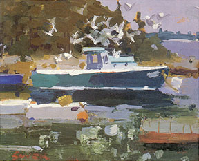
Mixing Subtle Greens - You could have a closet full of greens and still have better luck getting the right hues for a painting by mixing your own colors from the primary colors on your palette. A symphony of quiet greens makes Lobster Boat and Gulls (oil, 8 x 10) come softly alive. All greens were mixed from cadmium yellow pale, phthalo green, French ultramarine blue and white. Phthalo red rose was used as a neutralizing agent wherever grayed-down greens were needed.
No. 5 - Brownish greens. You can give any green a brownish cast if you add enough red, orange or other earth color. The French Barbizon painters of the 18th century were masters of brownish greens.
No. 6 - Earthy greens. These are similar to brownish greens, except that they range from the pale, sandy greens of the south all the way to the orangegreens of Utah and California. Earthy greens generally lean toward the warm side.
No. 7 - Rocky greens. These depend on geography, but they're usually warm and grayish, and are made from combinations of sap green, any of the cadmium reds, and either white or any of the cadmium yellows.
No. 8 - Desert greens. Because of the predominance of clear, blue skies, most desert foliage takes on a cooler, blue-green cast. But be alert for lots of warm green-orange reflected lights bouncing up from the ground and forming a strong secondary source of illumination.
No. 9 - Tropical greens. A potpourri of lush color, combining desert greens with the warm, earthy greens mentioned above. These appear often in Gauguin's work.
No. 10 - Forest greens. Viridian or phthalo green mixed with either a cool yellow or white work for evergreens. Warmer growths of trees call for Hooker's, sap or any of the permanent greens mixed with any of the cadmium yellows.
No. 11 - Garden greens. Hooker's, sap or any of the permanent greens lightened with cadmium yellow pale or light work here. Warm greens usually predominate, with the exception of the cooler greens of watermelons or cucumbers, and the grayish-white greens of onions and turnips (where viridian mixed with white works well).
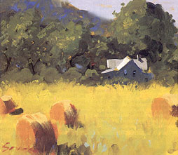
Unifying with a Primary - Farm Near Elmira (oil, 11x 13) is an example of using a warm foreground, then coofing the colors as they recede. The entire canvas was first underpainted with cadmium yellow pale. The warm green was created by scumbling a small amount of viridian green into the passage. French ultramarine blue replaced the viridian for the cooler middle ground.
No. 12 - Water greens. Usually, the greenish-gray mud or rocks at the bottom of a body of water influence the color of the surface. Even sand can take on a greenish cast when wet. Sap green combined with any of the cadmium reds and white, as well as mixtures of any of the cadmium yellows with ultramarine blue work well here, especially if lots of sky is reflected on the surface.
No. 13 - Spring greens. These are some of the most beautiful greens found in nature. They can be created with pastel combinations of cadmium yellow pale and either sap or viridian green, or phthalo or French ultramarine blue. Monet, Pissarro and Sisley were masters of these combinations.
No.14 - Summer greens. Because of its unvarying uniformity, this is the hardest kind of green to paint. Most situations can be covered with permanent green light, medium and deep lightened with cadmium yellow light or pale, and deepened with French ultramarine blue.
No. 15 - Autumn greens. Autumn offers a riot of color, with yellow-greens bursting into blazing oranges and fiery reds. To recreate this, use lots of sap green altered with either burnt sienna and cadmium orange or mixtures of both the warmer and cooler cadmium yellows. To keep the greens looking fresh and vital, try to key down the brightness of blue skies in autumn paintings.
No. 16 - Foggy greens. Winslow Homer wrote the book on this one. Try using viridian and white neutralized with a touch of either cool red or gray. Warmer variations could include cadmium yellow pale mixed with any of the cadmium reds, French ultramarine blue and white.
No. 17 - Stormy greens. Hurricanes, tornados and rainstorms have a menacing quality that green can capture very effectively. Try viridian or phthalo greens combined with white and any of the reds - the cooler the red, the more ominous the effect. The paintings of Thomas Hart Benton provide an excellent reference point here.
No. 18 - Sunstruck greens. Strongly contrasted variations of the warm and cool greens already described in examples No. 1 and 2 of this list. Capturing these greens occupied the lifetimes of French and American Impressionists.

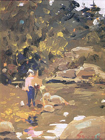
Creating Harmony - Except for the touch of phthalo red rose used in the shirt and fleshtones of the figure, Landscape and Artist (oil, 8 x 6) was done with only three colors., cadmium red light, cadmium yellow pale and French ultramarine blue plus white. The result makes the scheme of greens used in the foliage and reflections harmonize with the rocks, sky and figure.
No. 19 - Moonstruck greens. These are cool greens that can be recreated using viridian or phthalo green lightened with white. The shadow passages found in these greens are surprisingly warm, with viridian or phthalo green heated with such colors as burnt sienna, cadmium red or cadmium orange.
No. 20 - Fleshy greens. These greens vary from person to person, but generally you can use a small-to-moderate amount of sap, chrome oxide or permanent green deep to create warmer complexions. Cooler complexions call for small-to-moderate amounts of either viridian or cooler combinations of cerulean blue and cadmium yellow light or pale.
No. 21 - Synthetic greens. Be it a vinyl boat cover, a nylon running suit or a bright turquoise-painted wooden door, just about any synthetic green you'll find can be matched with either viridian or phthalo green. The only exception is the color of money, which leans toward Hooker's green.
Having all these greens at your disposal requires an added sense of responsibility to the painting. Capturing a mood must take priority over colorful pyrotechnics that may jolt a viewer on first impact. Study the three paintings shown in this article, and notice how each one contains passages of bright, virile green. Yet none jar the eye with raw color. Farm Near Elmira juxtaposes bright yellow-greens in the foreground against the cooler greens of the middle-ground trees and distant hills. Also, notice how the white, light-struck rooftop intensifies surrounding greens even more.
Landscape and Artist employs a more subtle scheme of greens. With the exception of the white hat, pink shirt and small patch of blue-gray sky, the entire composition is built on variations of middle-toned greens. There are no intense contrasts here-they would negate the soft hush of earthy greens so key to evoking the stillness of an overcast day in the woods.
The coolest scheme of the three can be seen in Lobster Boat and Gulls. Notice how the phthalo green of the boat hull is echoed in both the foreground reflections and the trees on the distant shoreline. The bright orange buoy in the foreground provides added contrast to solidify the mood of solitude and mystery.
When you're working on a painting where green will predominate, it's a good idea to use only one red on your palette. A single red can enhance a predominantly green color scheme, especially when used as a neutralizing agent in mixing less-intense passages of the green. More than one red, however, can sap the zap out of even the brightest greens.
AVOIDING A DEEP GREEN RUT
Although we singled out green for study here, the real lesson goes beyond any individual color. The object isn't to master an individual color - that's like learning to play one note on the piano. Instead, you should focus your energies on learning to mix all colors that present themselves to you. By refining this skill, you'll take a giant step toward painting exactly what you see.
|

![]()
